MediaHub
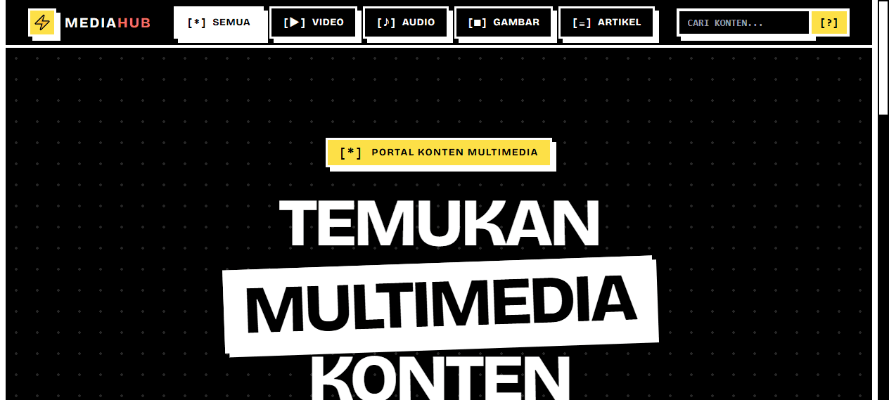
What it is
Multimedia portals usually inherit the visual language of whatever CMS powers them: rounded grey cards, a search bar, no memory. This started from the opposite end. The content hierarchy came first and dictated an identity loud enough to be remembered.
Why the style is a rule set
Heavy black borders, hard offset shadows, marigold on black, display type filling the frame. Media is visual, so the interface frames it like a poster instead of competing through subtlety.
The content model is flat and typed. Video, audio, image and article are four shapes of one thing, separated by a media kind and a set of type-specific fields. Browse, search and detail views stay uniform instead of branching four ways.
Next.js App Router with TypeScript. Item metadata loads eagerly while the heavy media is cached and served from the edge. Category filtering lives in URL state, so a filtered view is a shareable link. Typography and spacing were tokenised from the start, which made the loud style cheap to apply without exception.
The identity holds up on inner pages because the rules are absolute: every card takes a 3px border and an 8px shadow. One element with a soft shadow or a 1px border and the whole frame reads as broken.